upper waypoint

How Youth-Led Design Can Influence KQED's App

Save ArticleSave Article
Failed to save article

Please try again

Julia Hughes (left) and Hannah Mansouri (right) at the first Youth Advisory Board meeting with KQED staff mentors and student board members.

“What do you do exactly?” This is one of the questions I get asked all the time as a Product Manager. Even though Product Management has recently become a key role in technology firms, it’s still a mystery to many people. We are responsible for the strategy, development, and overall successful launch of digital products, serving as a bridge between the various groups involved in the product life cycle, including customers, engineers, and executives. One thing we do a lot of is sharing best practices, frameworks and processes – this act of sharing data and knowledge is how we are growing as an industry so quickly.

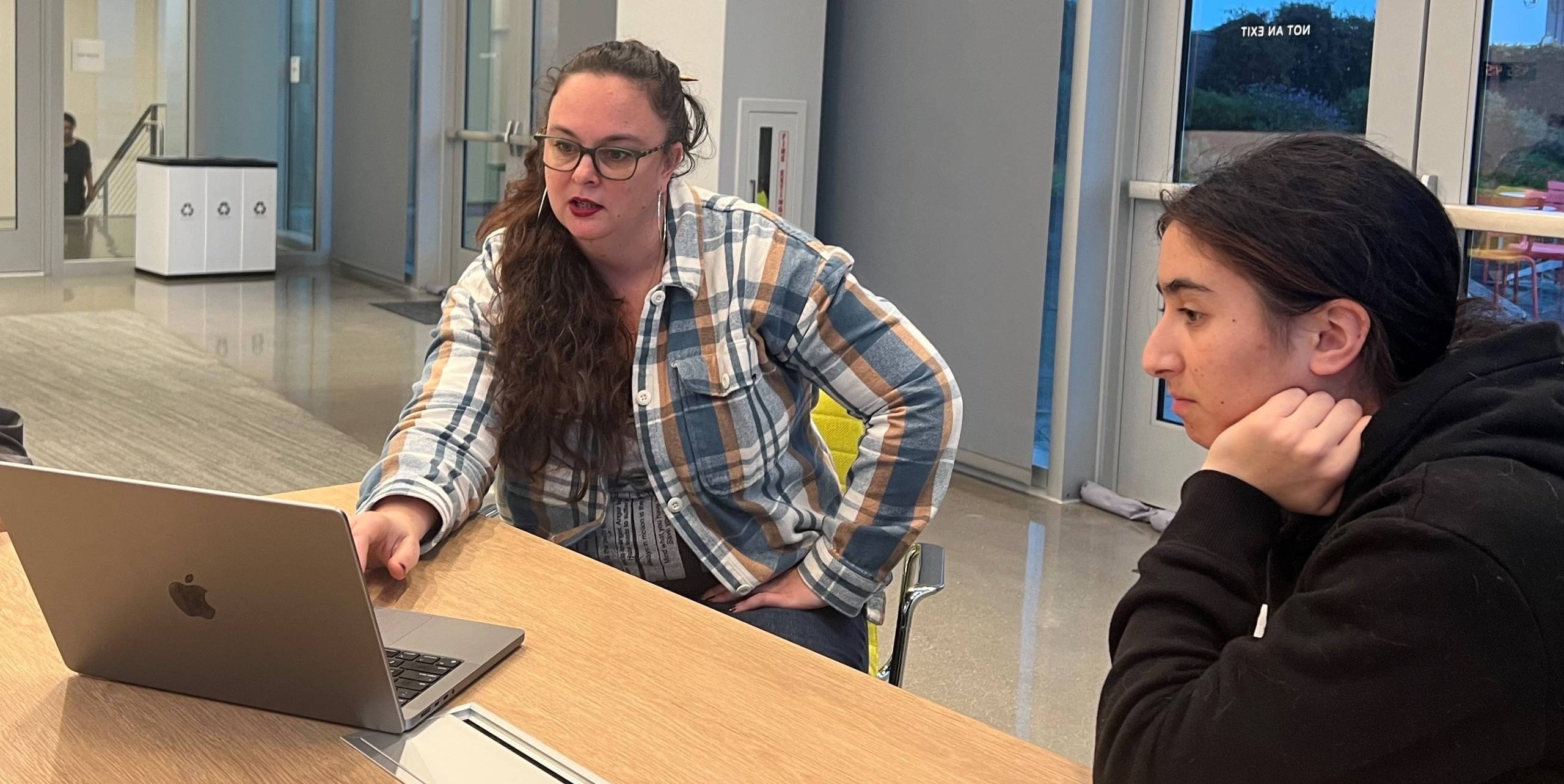
I was personally hella juiced to be able to participate as a KQED staff mentor this season with KQED’s Youth Advisory Board. We got to dive into the product lifecycle we use for our apps at KQED, and I got to share what I do with Hannah, my Youth Advisory Board mentee from California Virtual Academy Sonoma. It’s essential to bring in the voice of the next generation as we frame what is important to build for all of KQED’s community. Thanks to this experience with Hannah, I have a few ideas ready to take back to the mobile app team to see if we can turn them into reality in our app. Our process was guided by the principles of Design Thinking – focusing on problem-solving and creating a great experience for our users – for impactful product development. I hope you enjoy Hannah’s reflection on our process where collaboration, empathy, and iteration reign supreme.


Hannah’s Reflection

Step 1: Empathize

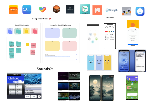
To begin, we first had to understand our user base. Most listeners and users of the KQED app are middle-aged and older. In order to attract new audiences and grow KQED’s user base, we researched topics and approaches that would be relevant to younger generations. Mental health is a pressing matter among today’s youth, so we figured that one way to cater to their interests would be to implement a mental health check-in upon opening the app. Users could rate how they are feeling and the app would curate their news based on the rating. For example, if a user gives a lower rating, their news feed would show more uplifting stories and avoid potentially triggering ones. We researched features from popular mental health-oriented apps, such as the mood check ins from Headspace and Calm, to get a sense of what is available today for mental health and where there is still a user need to fill.

Sponsored

Step 2: Define

After analyzing our audience and conducting our initial research in the first phase, we went on to frame the main issues of the current KQED app. We found that one problem is the layout of the app. With the absence of a search bar, it is difficult to find specific content and there is no way to easily access archived stories. This makes it difficult for users to do research or find older articles. The presentation of the articles also feels cramped and users are not able to change the font size nor customize other aspects of their viewing experience. This makes the app inaccessible to people who may have impaired vision or find it difficult to read on certain devices. I also noticed that the app didn’t show many articles featuring local news and events, which seemed a missed opportunity to showcase content that would engage and inform our local community.

Collage of logos and screenshots of various mobile apps.
Screenshot from Julia and Hannah’s Miro collaboration board. They looked at features and aesthetics of popular mental health apps to understand the current state of the mental health apps landscape.

Step 3: Ideation and Prototyping

With the main issues of the app in mind, we brainstormed potential features for the prototype. One of the ways we brainstormed was using the Crazy 8s method. It is a fast sketching exercise that challenges people to sketch eight distinct ideas in eight minutes. In this method my mentor, Julia, and I wrote down the features we thought would most improve the user experience. From our brainstorming we then narrowed down our ideas to a few key features – making content more accessible by adding a search bar and a better-organized toolbar. Other user benefits we added were a more readable font and a screen time check.

Two pieces of 8.5 by 11 inch paper side by side. Each piece of paper has eight hand-drawn images of mobile app ideas.
Hannah and Julia’s Crazy 8s exercises. Hannah’s is on the left. Julia’s is on the right.

Step 4: Testing and Iteration

Next, if we had more time, we would conduct user testing by sending out a survey to KQED’s audience asking what features they like best. To replicate this, I asked my friends and family which features from our prototype they preferred. I showed them the original design of the app compared to the features from our prototype and they agreed that the new toolbar and search bar improved their experience.

Multiple smart phone interfaces depicting various app features.
Screenshot from Julia and Hannah’s Miro collaboration board. They worked on low fidelity prototypes for the main features identified from their brainstorming sessions.

Final Reflection

Working on the KQED app has been a very creative and imaginative process. It has required extensive planning, brainstorming, and researching of different user experiences. With my mentor Julia Hughes walking me through the steps, we were able to come up with some great ideas to improve the KQED app.

For more on how youth are impacting KQED, check out Youth Takeover.

lower waypoint
next waypoint