upper waypoint

Six Ways to View Bay Area Compliance With Coronavirus 'Shelter' Orders

Save ArticleSave Article
Failed to save article

Please try again

A cyclist at the closed Robin Williams Meadow in San Francisco's Golden Gate Park on April 20, 2020. (Justin Sullivan/Getty Images)

W

ith Bay Area health officers releasing details of the region’s latest coronavirus shelter-at-home orders, it’s a natural moment to ask just exactly how we’re doing in terms of going along with the directives.

As it happens, virtually all of us who are glued to our mobile devices every waking hour are engaged in a massive reporting project that answers that very question. A wide range of apps on our gadgets, from mapping and dating services to fitness trackers, can watch where we are and capture that information.

You can guess the rest: App makers use the data to personalize and “improve” the services they offer you. They also sell some of what they capture to third parties that analyze the information for a wide range of other purposes. Assessing traffic and congestion in our cities is one popular use of such data.

Yes, this state of things does raise privacy concerns. And there are ways to turn off or limit the tracking — something most of us don’t do. But during the coronavirus pandemic, the details of our daily movements that our phones have been capturing and dutifully feeding into the cloud have given analysts a chance to see to what extent we’re actually locked down.

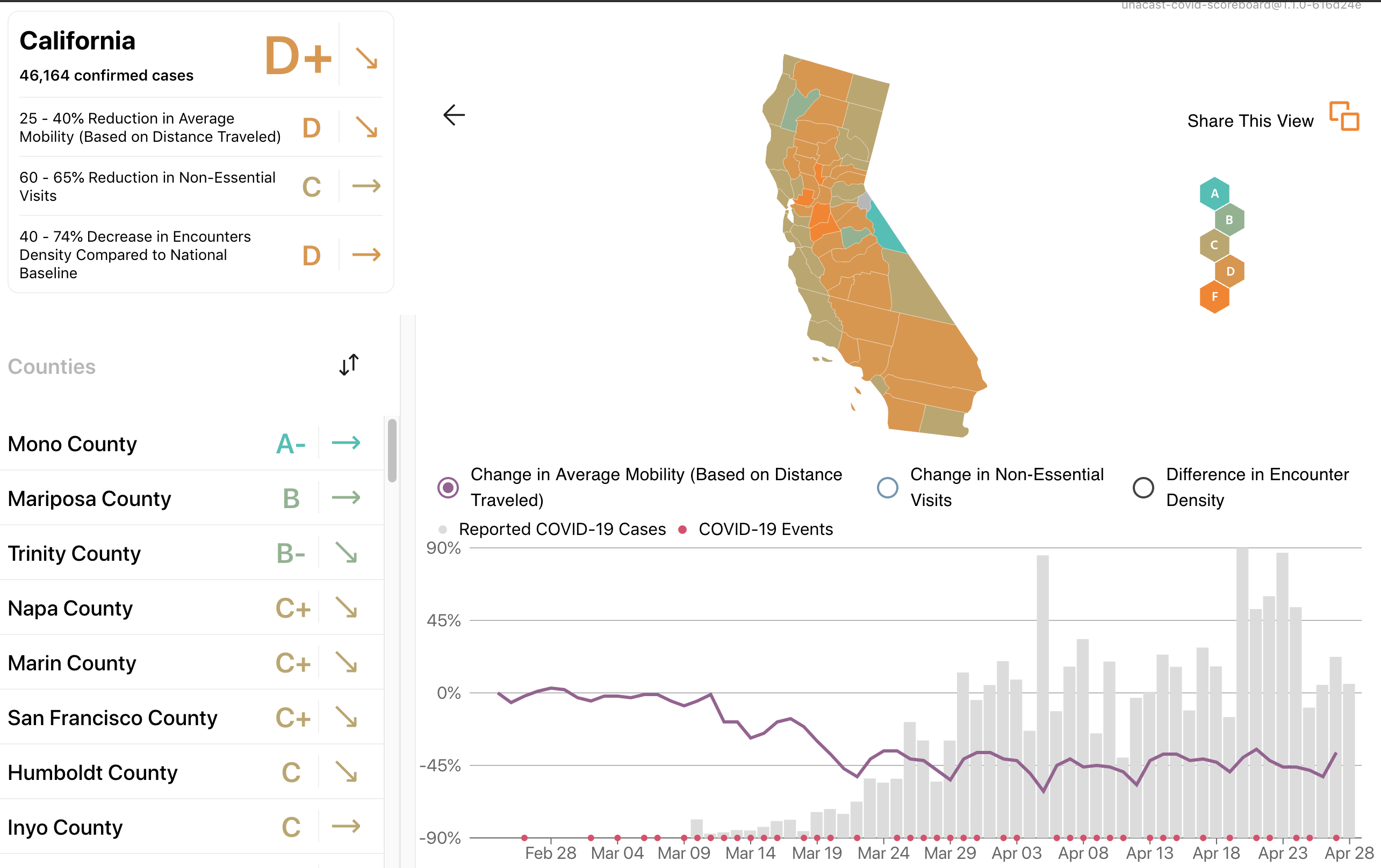
And the overall answer is: We’re pretty locked down. Data show we’re traveling far less and staying at home far more. Here's a quick rundown of some of the major analysis services issuing reports on our activity during the pandemic:

StreetLight Data

A screenshot of an interactive StreetLight map tracking vehicle miles traveled in every county in the Bay Area and throughout the United States. (Streetlight.com)

StreetLight Data is a San Francisco-based transportation analysis firm that was in the news last year for a report on potential access problems for California communities facing high wildfire risks.

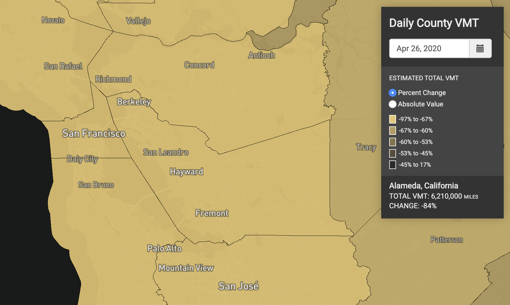
To report on some of the impacts of COVID-19, StreetLight has partnered with another data firm, Cuebiq, and put together an interactive national map of how total vehicle miles traveled has changed during the pandemic compared to a January baseline. In the Bay Area, not surprisingly, the total miles we're all traveling is way down — in the 85% to 90% range in San Francisco and between 63% to 67% in Solano County, the jurisdiction with the smallest decrease over the last six weeks. StreetLight's map is relatively easy to use and is comparatively current, with the most recent travel data just two to three days old.

Sponsored

Cuebiq

A screenshot of Cuebiq's COVID-19 Mobility Insights interactive.

New York-based Cuebiq provides the most detailed, complex and hard-to-use view of pandemic behavior trends in its COVID-19 Mobility Insights map. The company's analysis shows the number of us staying at home and how far we're traveling from shelter. It even provides a view of how social inequality is playing out in the pandemic by analyzing shelter-at-home trends in higher-income and lower-income areas.

We mentioned that Cuebiq's interface for this data is rather hard to use. By that, we mean that it takes a bit of patience and practice to learn to navigate the interactive map. We haven't found a way to drag the map to an area of interest; searching for the geographic area you're interested in seems to work best. The same goes for drilling down to the accompanying tables showing stay-at-home trends and week-over-week changes. It takes some work. A nice feature attached to the bottom of the map, showing travel trends over the last several weeks or the timeframe of your choosing, is very hard to read. Still, there is a lot here to absorb.

Unacast

Screenshot of Unacast's Social Distancing Scoreboard for California. (Unacast)

Unacast, a Norwegian startup that once did entertainment audience analysis, has developed a Social Distancing Scoreboard that rates every U.S. state and county on three metrics: changes in travel, the number of non-essential trips and "encounter density" — essentially, the frequency with which strangers (read: potential coronavirus vectors) wind up in the same place with other strangers. The Unacast data is very fresh, and its graphics include up-to-the-date trend lines on all three indicators.

But some of Unacast's grades are perplexing.

Its scoreboard gives California a D+ for social distancing measures as of April 29 while it gives New York state, the epicenter of the national pandemic, a C-. San Francisco, with 23 COVID-19 deaths, gets a C+, while Manhattan, with twice the population and nearly 100 times as many people succumbing, gets a B-.

Orbital Insight

Orbital Insight map showing difference in travel distances recorded in U.S. counties in early and mid-April. (Orbital Insight)

Orbital Insight, a Palo Alto-based geospatial analysis firm, has been tracking travel patterns and time spent at home throughout the coronavirus outbreak. The company says its data shows that San Francisco residents have been spending about 80% of their time at home since shelter orders were imposed six-plus weeks ago. That's a dramatic change from the pattern pre-pandemic. The company says it's detecting signs of "quarantine fatigue" with travel distances edging up in many states.

Google

Screenshot of recent Google Mobility Report data for Santa Clara County. (Google)

Google, which already knows more about you than you know yourself, has been employing users' location data to produce what it's calling Community Mobility Reports for scores of countries and every state and county in the United States. The data capture activity at transit stations, grocery and drug stores, retail and recreation outlets, parks and workplaces — as well as time spent at home. For California and the Bay Area, the data isn't super up-to-date: As of this writing on April 29, its numbers only run through April 11 (since updated to April 26). But they do provide a snapshot of how public activity contracted during the first few weeks of the pandemic.

Apple


Apple is approaching the problem of estimating public travel from a different direction. The company has developed mobility trend reports based on routing requests (i.e., directions) that Apple device users submit through the Maps app.

The data shows a steep drop here for driving, transit and walking directions. Although all three types of requests are still way down from the baseline levels in January and early February, they're showing a slight uptick in recent days.

Sponsored

lower waypoint
next waypoint
Stunning Archival Photos of the 1906 Earthquake and FireCould Protesters Who Shut Down Golden Gate Bridge Be Charged With False Imprisonment?San Francisco Sues Oakland Over Plan to Change Airport NameAfter Parole, ICE Deported This Refugee Back to a Country He Never KnewHow a Pivotal Case on Homelessness Could Redefine Policies in California and the NationAlameda County DA Charges 3 Police Officers With Manslaughter in Death of Mario GonzalezDeath Doula Alua Arthur on How and Why to Prepare for the EndCalifornia Pet Owners Could Rent Apartments More Easily Under New BillGaza Aid Flotilla to Include Bay Area ResidentsDespite Progress, Black Californians Still Face Major Challenges In Closing Equality Gap