The developers say their inspiration for the project was a recent feature in the New Yorker that displayed similar data around New York’s subway stops.
“It was just a little side project we decided to do over the weekend,” Grover said. “It took about a day to pull together the data, and another day to build the visualization, and maybe a day after to tweak and polish.”
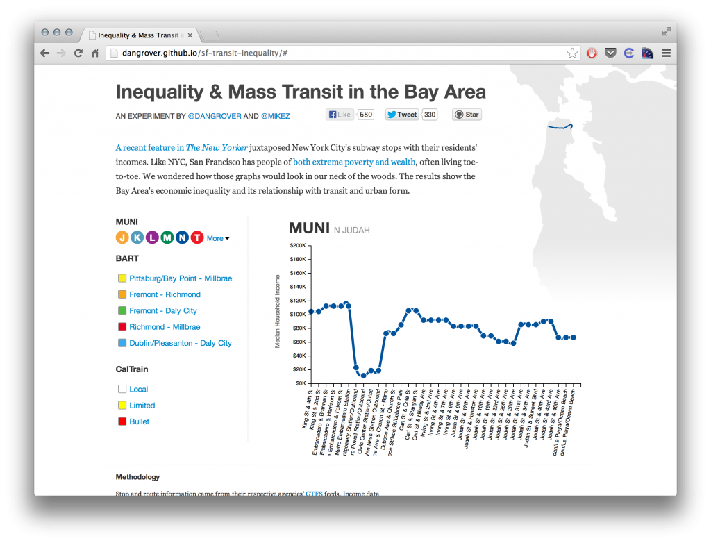
As provocative as the data appear, Grover cautioned that in some cases “the values can be way off because the area the train station is in is not representative of the total area.”
But he also has developed some tentative conclusions and interpretations from the mapping. His take:
- "The Tenderloin is so uncanny. It's near City Hall, and the places where the U.N. Charter and the Peace Treaty with Japan were signed. It's so well connected and central, and yet no one wants to be there. In some cities, people would pay a heavy premium to be in an area with its attributes."
- "I live on Geary Street, which is to me the demilitarized zone between the Tenderloin and Nob Hill, and it's incredible the difference between one street down and one street up. When I lived in NYC, I lived in a similar 'zone' between the Upper East Side and Spanish Harlem, and the New Yorker graph elegantly shows the cutoff at 96th St. San Francisco is even crazier, on a block-by-block basis, though."
- "The light-rail lines cut through extreme wealth and poverty, but when you look at the buses, you realize that San Francisco does still have a big middle class, and they're all out chilling in the Sunset and Richmond."
The code used to create the project is all open source and up on GitHub.