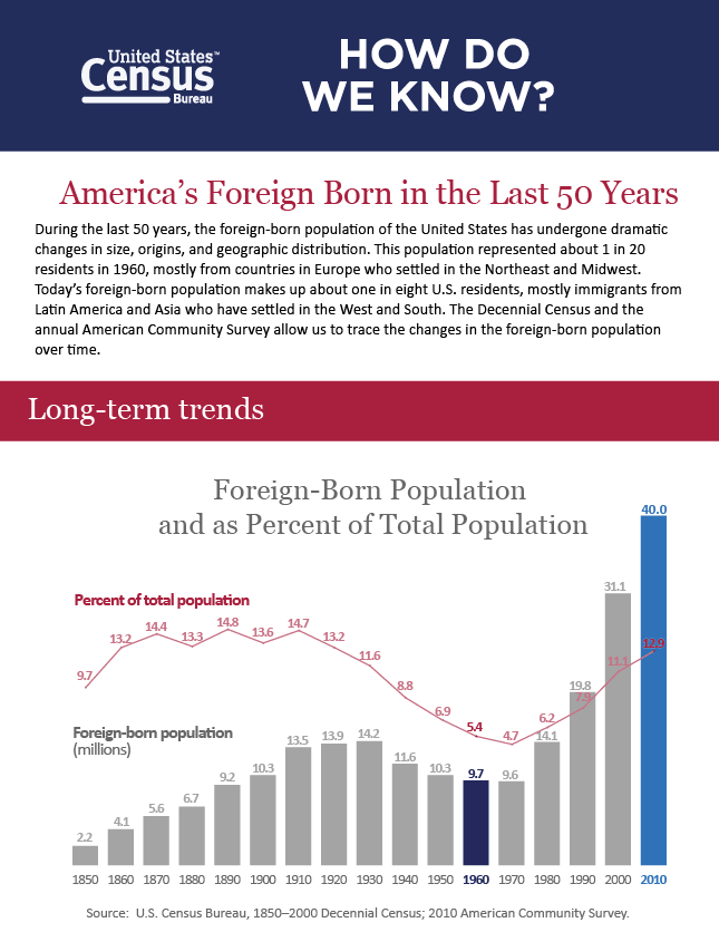
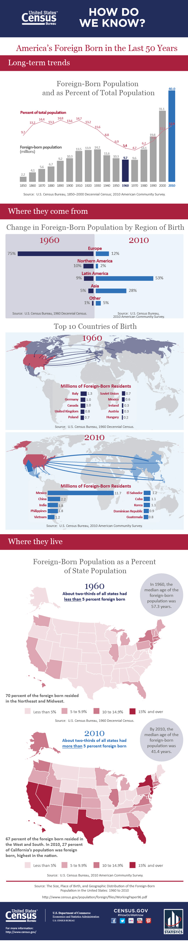
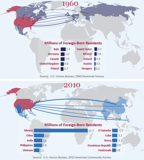
 Over the last 50 years, America's foreign-born population has changed dramatically in size, origins, and geographic distribution. According to the U.S. Census Bureau, in 1960 immigrants (both legal and undocumented) represented roughly 1 in 20 residents in the U.S. Most of them came from European countries and settled in the Northeast and Midwest. Today, it's a whole new ballgame: about 1 in 8 U.S. residents are now foreign-born, the vast majority are from Latin America and Asia, and most live in the West and South.
The infographic below, produced by the Census Bureau, uses data from the decennial census and the American Community Survey to illustrate the massive changes that have occurred over the last half century.