upper waypoint

MAP: It's Equal Pay Day! How Big Is the Gender Wage Gap Where You Live?

Save ArticleSave Article
Failed to save article

Please try again

Today -- April 4 -- is "Equal Pay Day." It marks the number of days into 2017 (plus all of 2016) that an average American woman would need to work in order to make the same amount that an average man made in 2016.

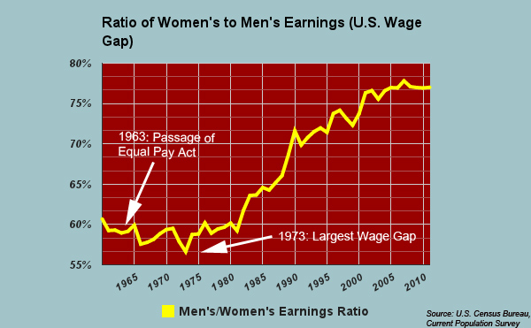
Although the the gender wage gap has narrowed significantly in the last 50 years, it remains stubbornly high. Nationwide, women are still paid, on average, about 80 cents for every dollar a man makes, according to the National Women's Law Center's analysis of American Community Survey wage data. That gap varies widely by region, and it grows significantly wider for women of color.

Women make up about half the U.S. workforce. They're the main breadwinners in roughly 40 percent of households and have eclipsed men in the number of college and graduate degrees earned, according to NWLC.

Yet, on average, women earn less than men in almost every occupation for which there is sufficient wage data. The median wage for full-time male workers in 2014 was $50,383, as compared to $39,621 for women, based on NWLC's analysis.

By state

Click on each state in the map below to see what a woman, on average, made for every dollar made by a man in 2014 (the ratio of female to male median earnings for full-time, year-round workers), and the difference that makes annual and over the course of a  40-year career. The map uses 2014 data from the American Community Survey, as collected and analyzed by the National Women's Law Center, an advocacy group (download the data here).

Sponsored

Figures are based on women's and men's 2014 median earnings for full-time, year-round work over a 40-year career, and are not adjusted for inflation.


Leading the pack was Washington D.C., where female full-time workers made, on average, 89.5 cents for every dollar male workers made. In California, which ranked eighth, women made 84.1 cents for every dollar made by men. Louisiana took up the rear: women there made a mere 65.3 cents for every dollar made by men.

When the Equal Pay Act was passed in 1963, full-time working women made, on average, about 59 cents for every dollar made by men. By 1973, the gap had actually grown wider:  women made 57 cents for every dollar men made. Since then, however, the gap has gradually narrowed, although it's remained fairly stagnant since 2000.

Why does the wage gap persist?

Reasons vary widely. Some academic studies argue that the disparity is due mainly to non-discriminatory factors related to division of labor in the home -- including childcare -- that often falls more heavily on women. Because of family-related circumstances, like giving birth, women overall are also more likely than men to have interrupted careers and work part-time, which can result in less-senior positions and lower wages. Additionally, women are still more likely than men to be employed in lower-paying service and support professions.

Some studies, however, point to evidence that the gender wage gap persists even after variables like family leave are taken into account, concluding that systemic discrimination remains a primary factor. This is especially notable for women of color, whose average pay is significantly less than white male counterparts. For every dollar that the average white man made in 2014, the average African-American woman made only 60.5 cents, and the average Latina made only 54.6 cents, according NWLC.

By profession

Even within the same professions, women today are still paid significantly less, on average, than men. But the pay gap varies dramatically by job, according to NPR's Planet Money team, which analyzed at Bureau of Labor Statistics data from 2012. The chart below, by Lam Thuy Vo, shows jobs where the wage gap is smallest and largest (based on comparisons of full-time workers). Part of the gap in pay, Vo notes, results from professional decisions some women voluntarily make. She writes: "Among physicians, for example, women are more likely than men to choose lower-paid specialties (though this does not explain all of the pay gap among doctors)." It's also interesting to note, writes Vo, that the jobs where the gap is biggest are the one's that pay more.

Percentages are based on the median weekly earnings of full-time wage and salary workers. Not all jobs have enough workers for BLS to calculate a meaningful ratio.Source: Bureau of Labor StatisticsCredit: Lam Thuy Vo / NPR
Percentages are based on the median weekly earnings of full-time wage and salary workers. Not all jobs have enough workers for BLS to calculate a meaningful ratio.
Source: Bureau of Labor Statistics
Credit: Lam Thuy Vo / NPR

lower waypoint
next waypoint
Why So Many Central Americans Are Seeking Asylum in the U.S.Real-Time Interactive Earthquake Map: Get to Know Your Local FaultsIt's Really Happening! This Is What KQED's Youth Takeover Looks LikeWhen Rivers Caught Fire: A Brief History of Earth Day (with Lesson Plan)A Look Inside the Youth Vaping CrazeIt's Almost Tax Day. This Is How the Government Spends Your Hard-Earned CashIs the Endangered Species Act at Risk of Extinction?March Madness and the Money: Should College Athletes Get Paid?How to Stop a Nuclear War: The Non-Proliferation Treaty, ExplainedMAP: What Does the U.S.-Mexico Border Really Look Like?