
Curious how much the ground shifted after the two large earthquakes last week in Southern California? NASA has just the map for that question — and it happens to look like beautiful, psychedelic art.
On July 4, a 6.4 magnitude quake hit the town of Ridgecrest, north of Los Angeles. The next evening, the area was jolted again by a 7.1 magnitude earthquake. Luckily, there were no serious injuries or major infrastructure damage.
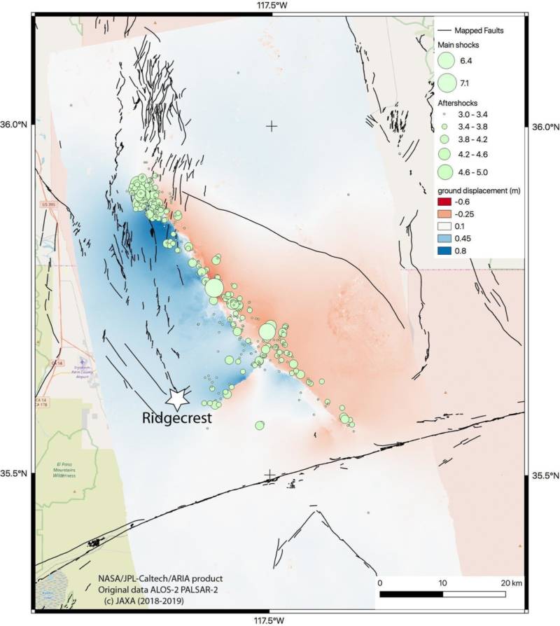
The map was created by the Advanced Rapid Imaging and Analysis team at NASA’s Jet Propulsion Laboratory. It shows rippling rainbows forming a circular pattern around the faults of the two quakes.
Each rainbow stripes means that the ground has been displaced there by some 4.8 inches. It’s the same logic as a topographic map, where lines that are closer together indicate steeper slopes. In this case, the closer together the rainbow stripes are, the more the ground was displaced by the temblor.
Eric Fielding, a geophysicist at JPL, says the parts of the map along the fault where the colors appear jumbled suggest even more dramatic movement of the ground.
He explains how they mapped the changes.
“We’ve taken a radar image of before the earthquake and another image after the earthquake,” Fielding tells NPR. They then compared each point’s change between the two images. “That allows us to measure the amounts that the ground moved either towards or away from the satellite.”
9(MDAxOTAwOTE4MDEyMTkxMDAzNjczZDljZA004))