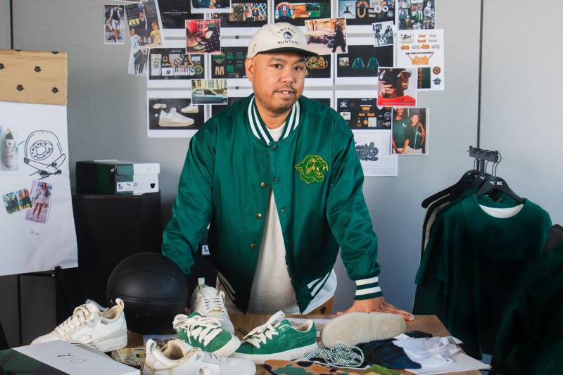
Dustin O. Canalin has previously designed gear for the NBA, Nike, Adidas, AND1, Converse and more. He's now the creative director of the Oakland Ballers. (Courtesy of Dustin O. Canalin)
In 2006, Too $hort imparted a timeless lesson on his song “Baller”: “You gotta keep tryin’, just don’t give up… How you gon’ ball if you got no hustle.”
With the tortured Oakland Athletics all but departed to Las Vegas, a group of Oaklanders — led by longtime friends and baseball fans Paul Freedman and Bryan Carmel — are doing just that. They’re dusting off, stepping back to the plate and exercising their ballerhood.
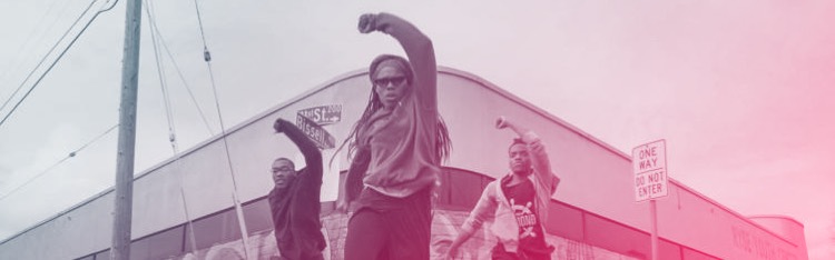
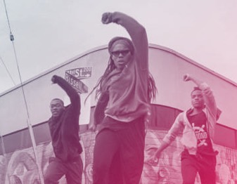
A new minor league baseball team, the Oakland B’s (short for Ballers), were publicly introduced on Nov. 28 at Laney College. Local figures — including Oakland Mayor Sheng Thao, Mistah F.A.B. and Hal the Hot Dog Guy — were in attendance to show support.
To some critics, simply choosing the next letter in the alphabet may seem like a lackadaisical effort to cover up an A’s-shaped hole left in Oakland. But those familiar with minor league baseball will know that it’s in line with the inventive — if not satirical — nature of lower-league teams, which are traditionally far less concerned with the status quo (ever heard of the Montgomery Biscuits or Rocket City Trash Pandas?).
Sponsored
Still, the B’s are no joke — and neither is their branding. The team’s logo was designed by Dustin O. Canalin, who led Nike’s development team for “The Town” jerseys worn in the Golden State Warriors’ final seasons in Oakland. He also designed the hat Steph Curry wore after breaking the NBA’s three-point point record in 2021, and illustrated Draymond Green’s T-shirt for the Warriors championship parade in 2022.
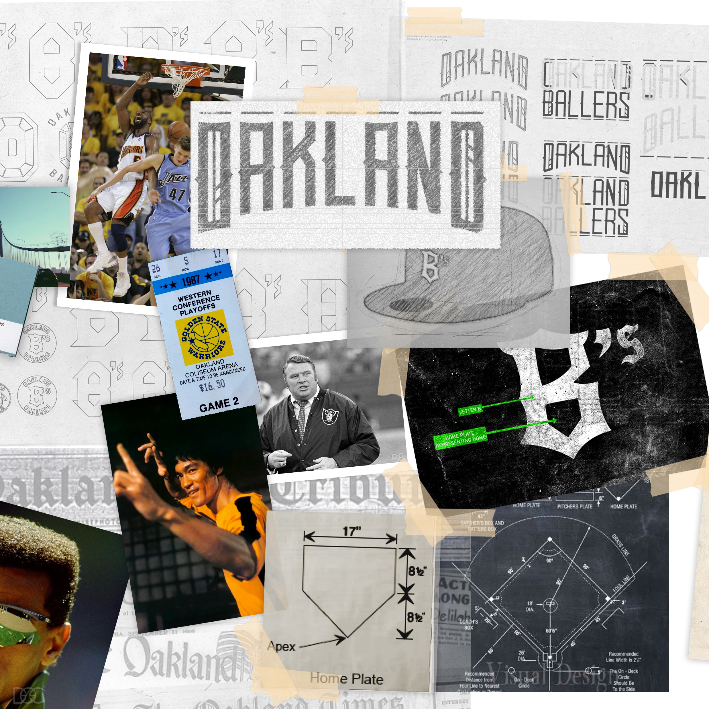
Dustin O. Canalin’s mood board for the Oakland Ballers includes sports history, local figures and aesthetic inspiration for old English fonts. (Courtesy of Dustin O. Canalin)
Canalin’s no rookie when it comes to baseball. He grew up near the Oakland Coliseum, playing shortstop on his high school team, where he befriended eventual MLB stars Dontrelle Willis and Jimmy Rollins. It’s also the sport that inspired his career as a current streetwear designer.
The Ballers’ creative director spoke with KQED Arts about his inspiration for the team’s aesthetic, Oakland’s storied past and the East Bay’s abundance of hustling.
This interview has been edited for length and clarity.
Alan Chazaro: Did you listen to Too $hort’s song “Baller” when you were brainstorming ideas for this logo? What does being a baller mean to you?
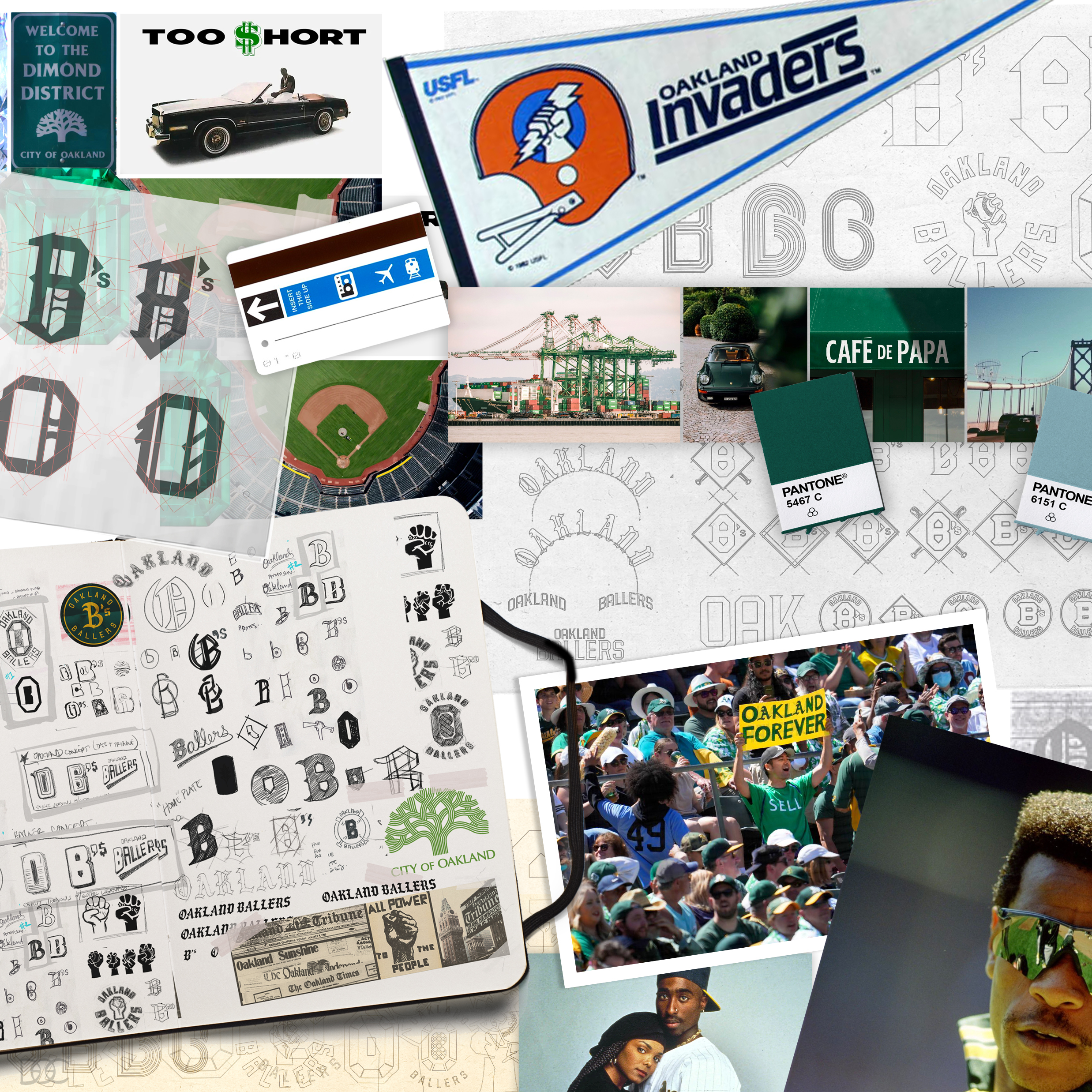
Dustin O. Canalin: Being a “baller” has a lot of connotations and symbolism … and it really fit with Oakland as a culture and community, and what I grew up on. I scoured for songs, words and meanings of baller and player. So Too $hort definitely came up. There’s always a connection between sports and music in Oakland.
The B’s is very similar to the A’s. How intentional was that? Is it meant as a diss?
The main idea was the B’s from the start. Any slights to the A’s kind of developed while digging more deeply into the creative side of it all. Something we didn’t want to do was a bootleg version of the A’s. In the Bay, there’s a lot of hometown pride where designers will make their own versions of something. We are building off heritage, identity … remembering the past and making sure we’re respectful. But we’re also making something new. From a design process, we started with a blank piece of paper.
The Ballers will be known as the B’s, and hope to debut at Laney College Baseball Field in 2024. (Courtesy of Dustin O. Canalin)
How would you describe the voice and tone of the final product?
We thought about the culture of Oakland, the fans, the feeling and impact we wanted to have, and then we boiled it down to what we ended up building around: a real cultural confidence. When you look at people who come from the Bay — whether it’s $hort, the Raiders, Bruce Lee, Damian Lillard, Mistah F.A.B. — they all have a certain DNA built into their personality. It’s a type of person with confidence.
When it comes to Oakland baseball, most fans will immediately think of the A’s. Did the forgotten legacies of other teams — like the Oakland Oaks, Larks and Commuters — come into play?
I wanted to understand the lifespan of sports in Oakland. I looked at everyone — the Oaks, Invaders, Warriors, when the A’s arrived, why the Oaks left. What I realized is that besides the Raiders, Invaders and Oaks, all those other teams were inherited by Oakland. They weren’t created here. The A’s and Warriors came from Kansas City and Philadelphia. They already had those names. So as far as this century goes, the Ballers and Roots are the only teams that have built their own identity on what Oakland is today.
One of your original logo ideas included a power fist clenching a baseball, which reminded me of Black Panther Party imagery. What other ideas did you sift through?
At first we looked at a diamond, the idea of a jewel, and we wanted to create an idea around stadiums as this diamond or medallion for a community. But it was too abstract. We also wanted to build off Oakland’s legacy [with] the Black Panthers. I’ve always thought their identity represented so much, and the language that was used throughout that generation has always been really powerful to me. But it’s not exactly what a sports team would need.
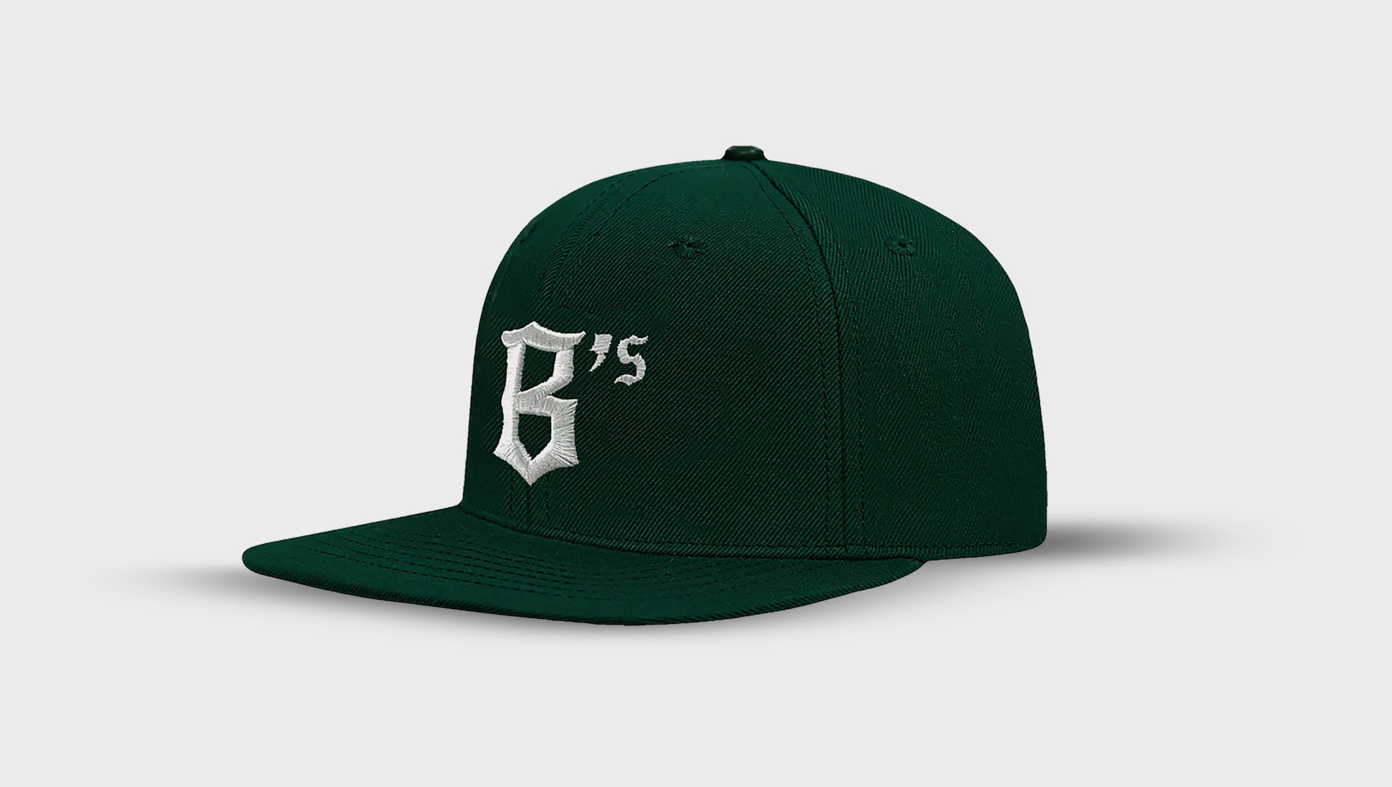
When I worked on the Town uniform [for the Warriors], I kept seeing images from my memories and research of Old English fonts — from the Oakland Tribune to the older teams like the Larks, even the bootleg T-shirts on East 14th. It’s iconic. That’s the direction that hit home for us. Having the home plate built into the letter was strategic. Oakland is home; this team is home. That shape was a touch to give this its own personality. We also didn’t want it to be overly obvious and overpowering. It’s subtle. Like they say, “It’s in you, not on you.”
What challenges did you face in creating a new logo for Oakland?
First and foremost, I knew the team wanted to represent something good for the community, especially with the A’s transitioning out. So I wanted to make sure the team’s identity didn’t overpower that goodness. The logo represents that goodness in Oakland. It’s a silent ambassador of the brand and city.
And it should look cool. A’s hats are a staple in fashion. I took that challenge to develop a new hat, a new signature for the city, and to make it cool. The letter isn’t styled perfectly. It has an edge. That’s on a designer nerd tip. That look helps it to embody everything we wanted.
The Oakland Ballers are only the second professional team to be birthed in Oakland since 2000. (Courtesy of Dustin O. Canalin)
Minor league baseball can be very tongue-in-cheek. Did you find any inspiration in the humor of the minors?
Baseball has always been my favorite sport, from a design perspective. It’s from a time of everything being hand-drawn, hand-embroidered, not computer-generated like everything is today. So I’m inspired by that essence of baseball and old minor league logos.
But being from the Bay, we’re not a joke. These uniforms, we want them to be ready for battle, not to be walking billboards or clowns. There’s a feeling of seriousness in being from Oakland. Look at the Raiders and Warriors. There’s no joke there. I think for this uniform we just wanted to make something ill. We darkened the colors to create a dark, deep green. It’s inspired by overcast weather, that toughness and darkness.
What’s your hope for the Oakland Ballers?
We’re not building anything that doesn’t already exist. The community is already there — we just needed a logo for it. I’ve gone to so many A’s games and barely watched the actual game. It’s about the experiences, the people, the tailgating, eating, hanging out. With pro baseball leaving Oakland … this team will be there for that now, to represent that. It’s one of those things that is happening quick, but the community is what will sustain it. Everything we’re doing is just providing the tools to go out and rep Oakland. It’s a lifestyle.
Why should Oakland’s sports fans, who have been through so much in recent years, give this upstart franchise a chance?
Sponsored
With this team, they’re really listening. This is not being managed by one person or a corporation, it’s built within the community, for the community. If you have a problem with it, your voice can get heard. There’s a permanent seat here for you. The experience will only be as good as the people make it.
lower waypoint
Care about what’s happening in Bay Area arts? Stay informed with one email every other week—right to your inbox.